Wakey — an alarm-clock concept inspired by David Hockney's Moving Focus
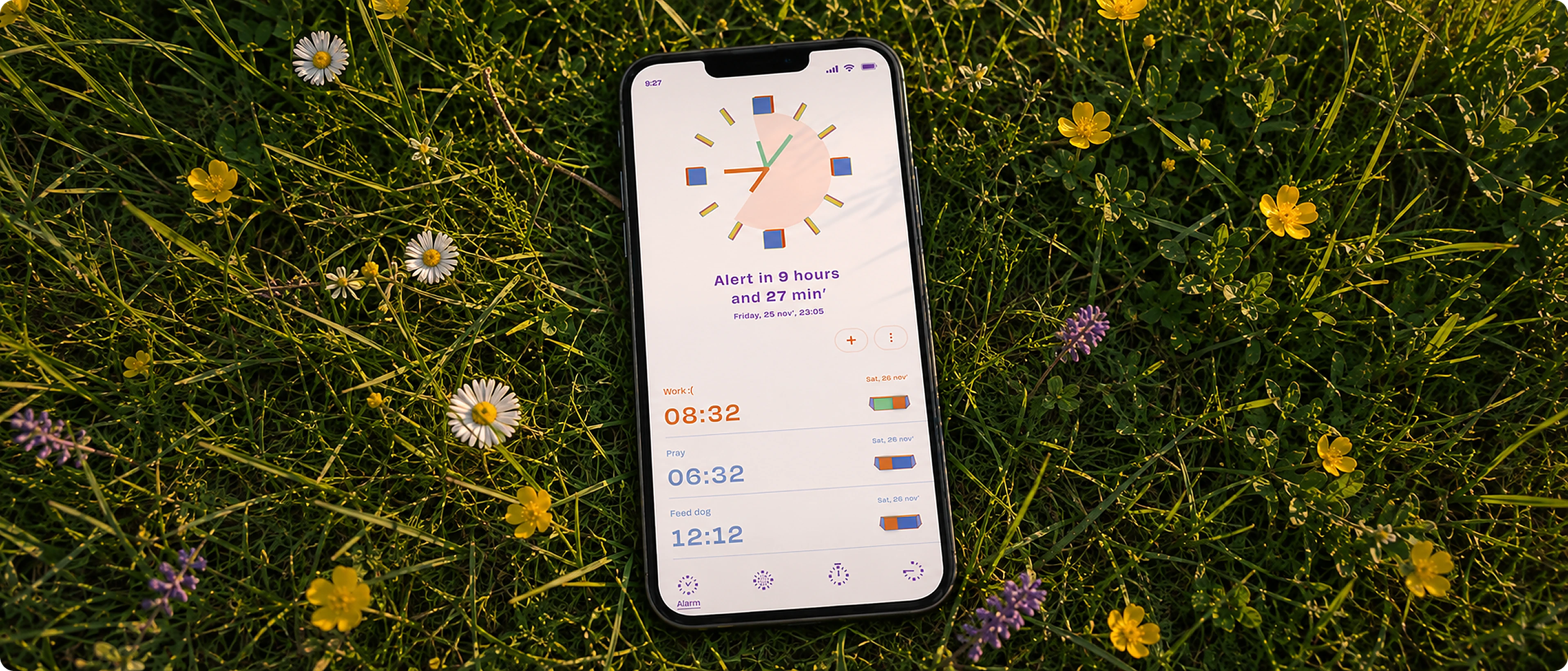
Introduction
Wakey is an exploration of how visual language can change the experience of an everyday tool. Inspired by David Hockney’s Moving Focus, I built the alarm clock interface around its bold colours, shapes, and playful energy, turning a functional interaction into something more expressive and engaging.
Details
- Type
- Self-initiated concept
- Source
- David Hockney, Moving Focus
- Tools
- Figma
- When
- 2023
Why Hockney
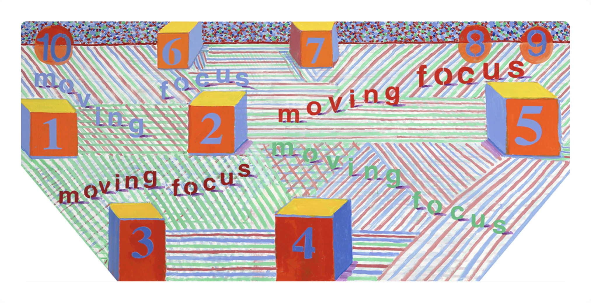
The painting was already
about time
Hockney doesn’t use one viewpoint. Objects tilt toward you, colours are flat and full strength, and numbers sit on the faces of things. That was the starting point.
Four principles that could shape both the look and the interaction:
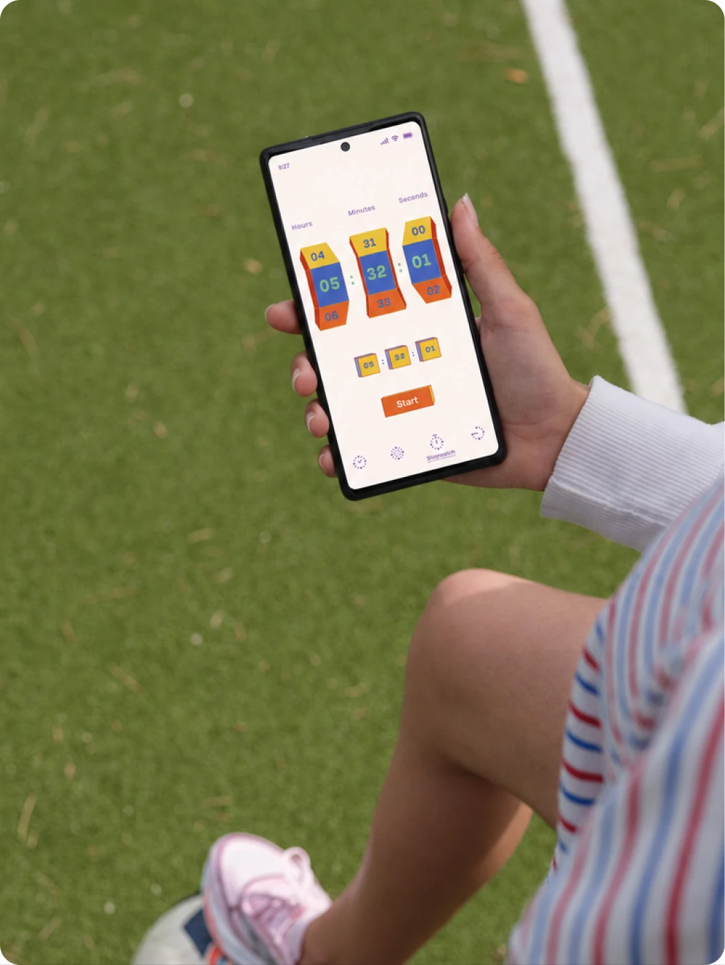
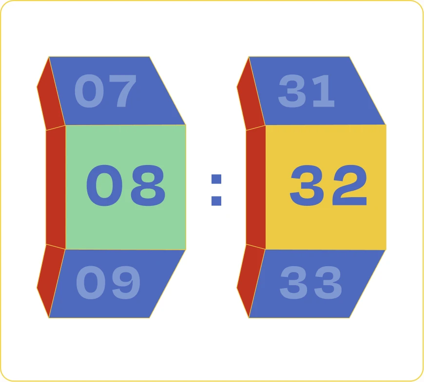
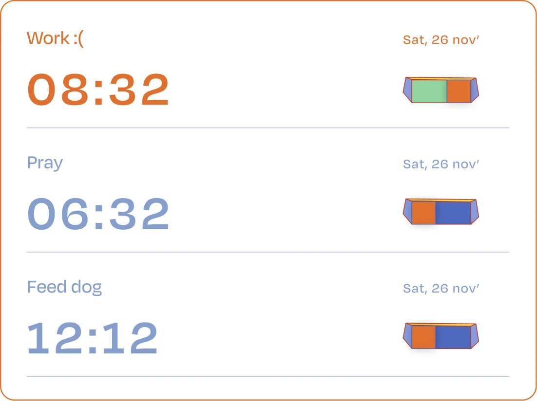
- Perspective as hierarchy. Cube faces tilt toward the reader, naturally bringing the time into focus.
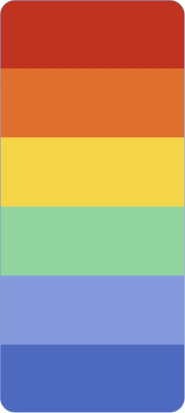
- Colour as meaning. A palette of six flat colours gives each colour a clear functional role.
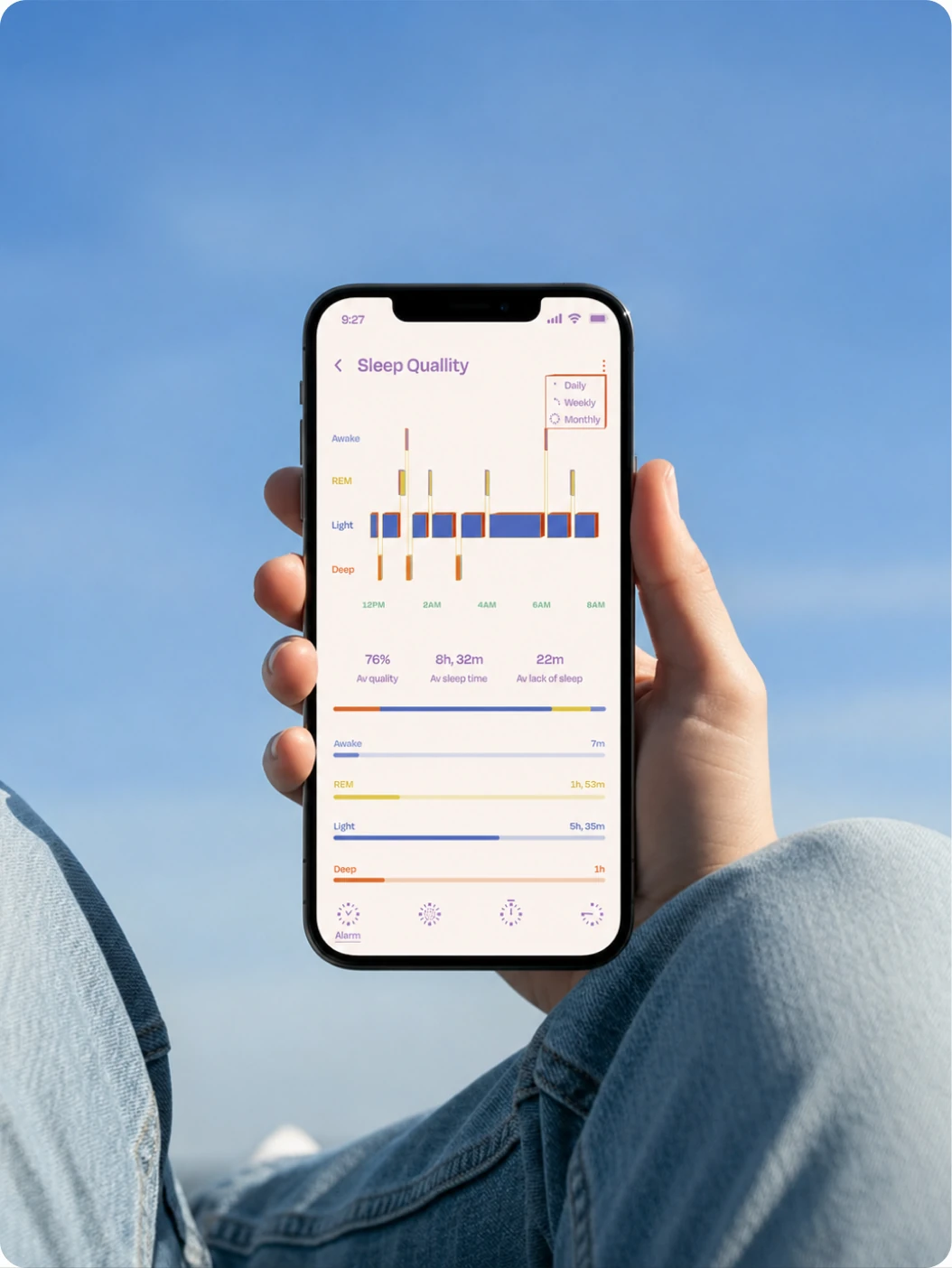
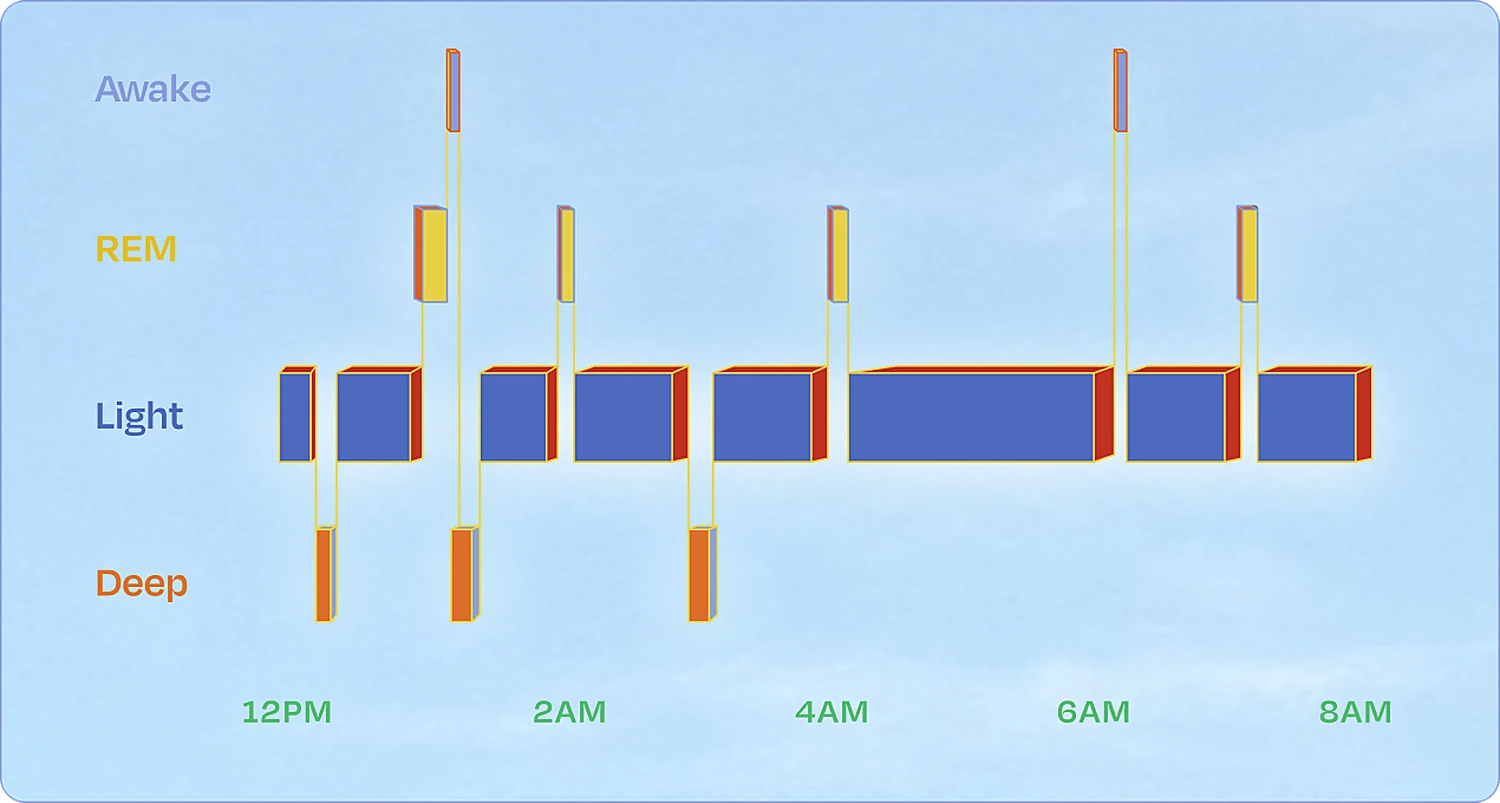
- Pattern as interaction. The painting’s striped ground becomes the sleep timeline, turning a visual motif into a useful control.
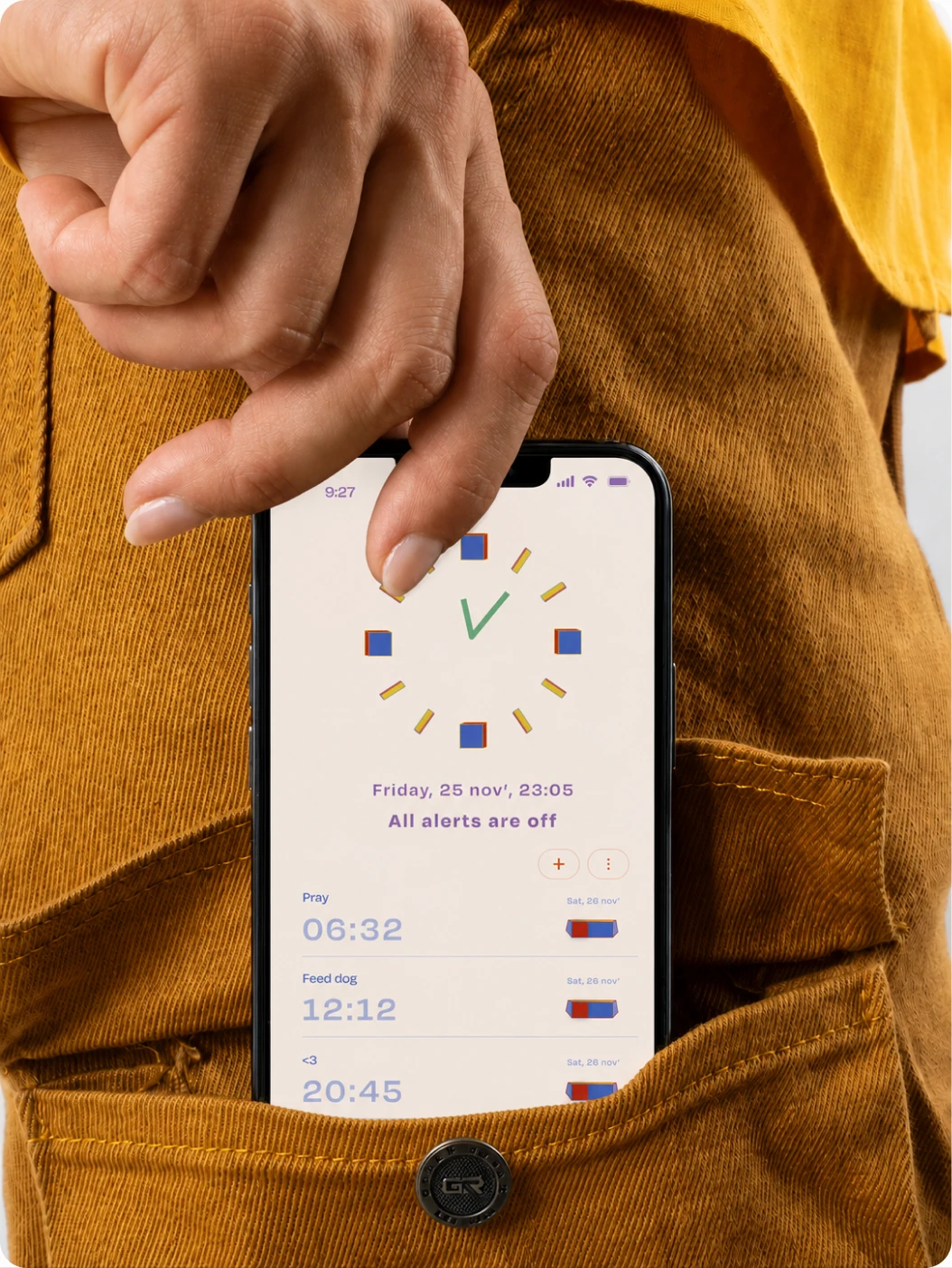
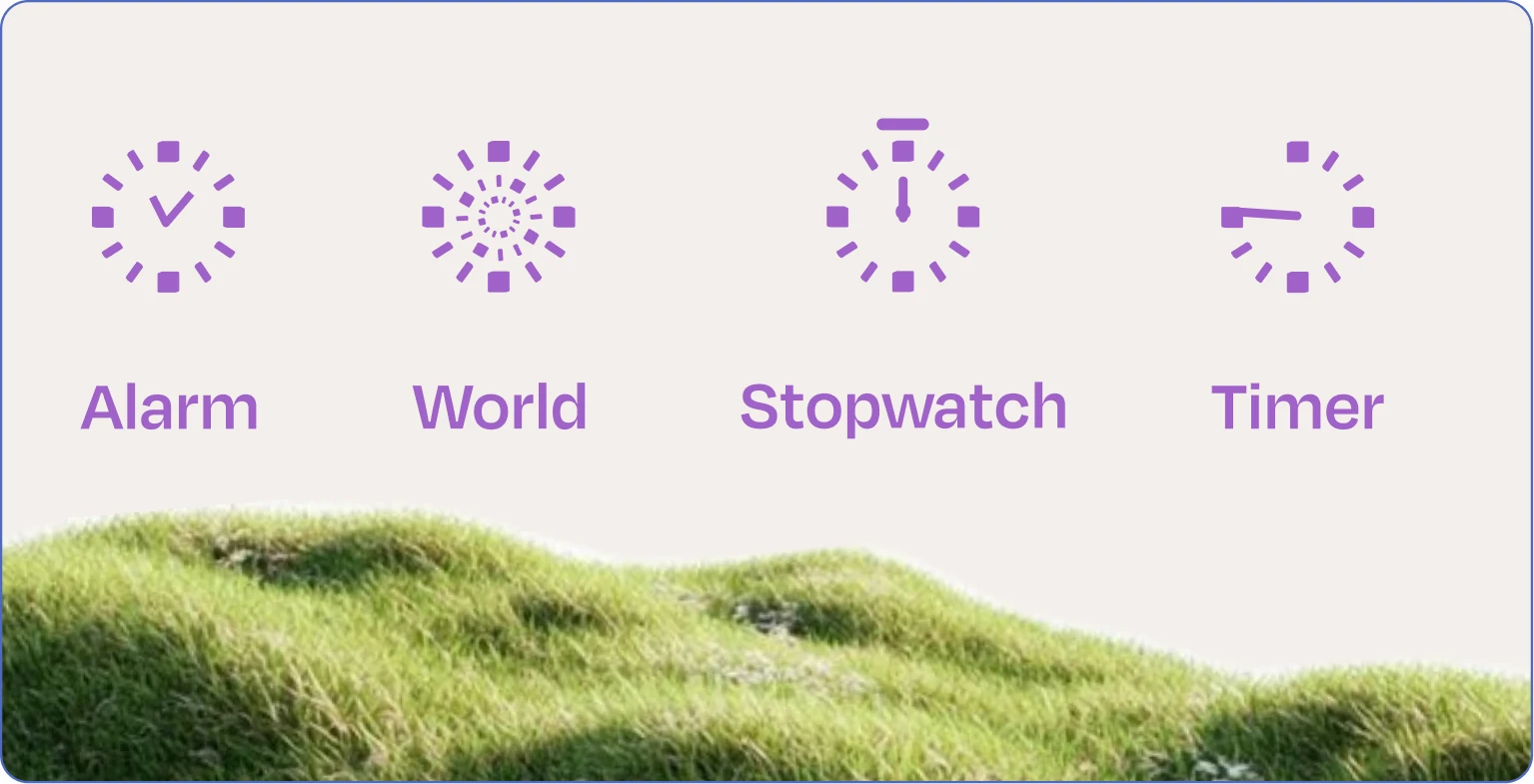
- Line as personality. The hand-drawn line carries through to the icons, preserving the playful character of the original.
From painting to screen

“What an artist is trying to do for people is bring them closer to something, because of course art is about sharing. You wouldn’t be an artist unless you wanted to share an experience, a thought.”